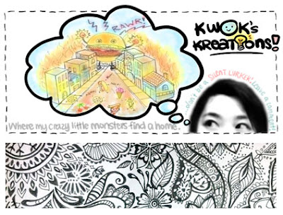
I'm a person who can often get RESTLESS, and I like change. Not drastic uncomfortable change, but creative change. So in my restlessness, I decided to change the look of my blog. I have to admit that right after I did it, I immediately missed the happy hamburger, who had been the permanent resident at the top of my page FOREVER (...and by "forever" I mean the two months that I've had this blog). Instead, I replaced him with what looks like the hamburger from hell, wreaking havoc on innocent foodie civilians... (what have I done?!?!)
Anyway, I decided to have YOU, my blog readers, decide which layout you like better. Or, you can give me a suggestion for something else (for example: the happy hamburger from the old layout + the "kwok's kreations" logo from the new layout).
Leave a comment and let me know! I'd really appreciate it! =)
OR


Angry burger!!
ReplyDeleteHaha creeeper look` xD
ReplyDeleteI like the 1st on best! He's so cute!!!
ReplyDeletethe happy one!
ReplyDelete